Why Build a Component Library?
For my 2025 portfolio, I set myself a technical challenge: decoupling the component development environment from the application that consumes those components. My objective was to experience both sides of a design system workflow—authoring production-grade components for external consumption and integrating them as read-only dependencies in a separate application.
An interactive component inventory that documents APIs, usage patterns, and live examples to streamline design-to-development handoff and ensure teams always use the latest approved implementations.
Inspiration & Design Process
I began by analyzing both the functional requirements of my portfolio and the expectations of its audience, then translated those insights into wireframes in Figma. I selected Carbon Design System as the architectural foundation and designed every component to align with its interaction patterns, accessibility standards, and visual conventions.
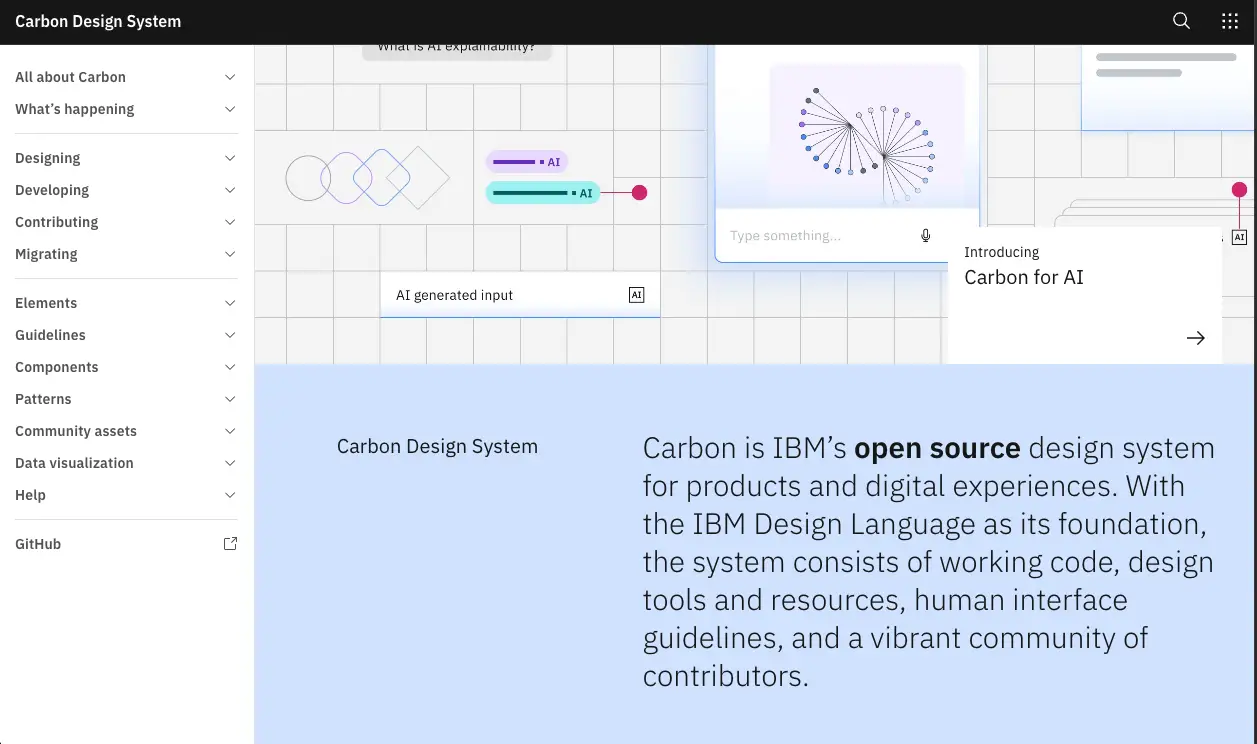
Storybook environment
I set up Storybook before the design prototypes were fully finalized. My goal was to create a developer experience that emphasized clarity, completeness, and ease of adoption. Inspired by Carbon's own Storybook implementation, I structured the environment around three core principles:
Documentation (clear use cases and implementation guidance)
Component Architecture (flexibility, reusability, and scalability)
Robustness (accessibility testing, type validation, and quality controls)
Demonstrates how components are documented, tested, and validated in isolation before being integrated into the production application.
Architecture, composition, and reusability
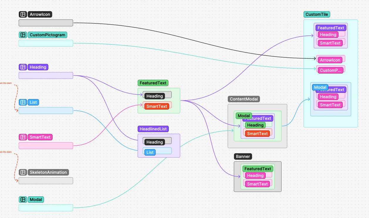
One of my primary objectives was to maximize component reusability. The architecture was built from small, single-responsibility primitives that were progressively composed into more sophisticated UI patterns.
My component engineering workflow followed this iterative process:
Build and test atomic components.
Compose larger components, optimize, and test.
Analyze dependencies, eliminate redundancy, refactor, and test.
Repeat until the architecture stabilized.
Each refactor had cascading effects across dependent components, TypeScript interfaces, and Storybook stories, requiring continuous architectural recalibration.
Adversity and roadblocks
This project involved numerous technical challenges that required persistence, extensive research, and systematic debugging. Most issues were related to environment configuration, regressions, and version compatibility.
Examples included:
Version Synchronization: Maintaining compatibility across React, Next.js, Storybook, and Carbon.
Regression Detection: Upgrading React to resolve one issue unexpectedly broke Carbon Tabs, which was discovered days later.
Composition Complexity: Reusing a shared component often required redesigning props, markup, dependencies, and internal logic.
Pivoting with a Unified Dependency Manager
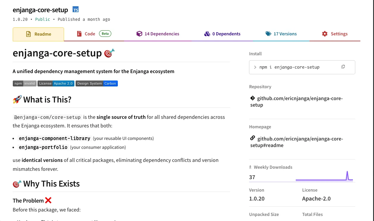
To eliminate recurring compatibility issues, I created a shared dependency management package that centralized configuration for both the portfolio and the component library. By sourcing dependencies from a single internal package, both projects remained version-aligned and configuration drift was eliminated.
Takeaway
This initiative took approximately two and a half months to complete. It was a deliberate investment in building a professional-grade engineering environment and a component ecosystem that meets modern standards for accessibility, scalability, and maintainability.
The result is a production-ready design system foundation that accelerates development while ensuring consistency and long-term sustainability.
Next steps
My next goal is to:
Test components in isolation to ensure they comply with WCAG accessibility standards.
Align the component library with the newly redesigned design system while improving accessibility.