Why creating a component library?
For my 2025 portfolio, I set a personal challenge: to separate the environment where components are developed from the environment where they are consumed. I wanted to experience both sides of the process—what it's like to develop components for consumption, and what it's like to consume read-only components.
Inspiration & Design process
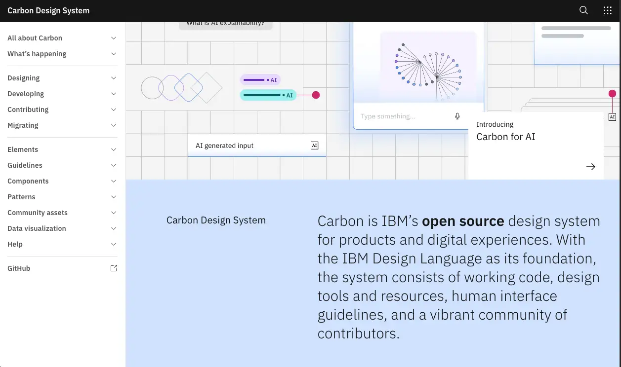
I began by reflecting on my portfolio's needs and the needs of its audience, then created a wireframe in Figma. I chose the Carbon Design System as my project's foundation and designed my components with its regulations in mind.

Storybook environment
I started setting up the Storybook environment even before the design prototypes were fully complete. My goal was to create a Storybook that reflected clarity, thoroughness, and a sense of ease for the consuming developers. Once again, I took inspiration from the Carbon Design System's Storybook and defined my setup by three key principles:
Documentation (clarity, clear description of use cases, etc.)
Component Architecture (flexibility, reusability, and scalability)
Robustness (accessibility tests, props validation, etc.)
Architecture, composition, and reusability
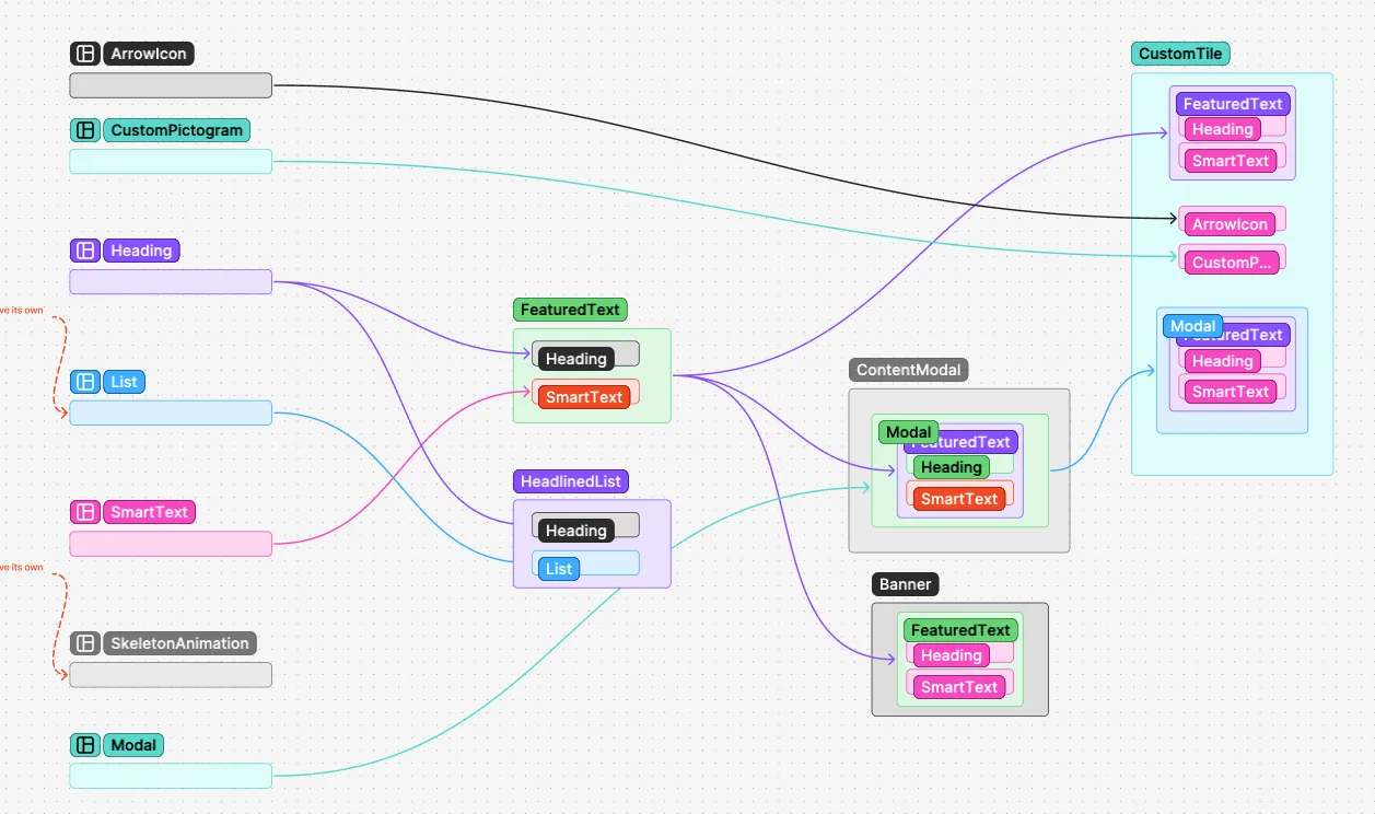
One of my primary goals was to make components as reusable as possible. The project's architecture was built from smaller components, each reduced to its simplest form, which were then reassembled into larger, more complex components.
My overall process for component composition was as follows:
Create components and test them.
Combine components into larger components, optimize, and test.
Assess dependencies, spot redundancies, break them down, and test.
Repeat steps 1 to 3 as many times as necessary.
Every re-engineering of a component had cascading effects on its dependencies, properties, types, and even its Storybook stories, which had to be reorganized each time.

Adversity and roadblocks
This project was full of roadblocks that required determination, extensive research, and patience. Most issues were related to environment configuration, regressions, and version compatibility.
For example:
Sync Issues: I regularly faced challenges synchronizing versions of React, Next.js, Storybook, and the Carbon Design System.
Cyclic Issues: A core component like Carbon Tabs stopped working after I upgraded React's version to fix another issue. I only noticed the problem days later, which left me initially clueless.
Composition Issues: Component composition was sometimes problematic, as reusing a single component in several places often demanded a complete architectural redesign of props, markup, dependencies, and even internal logic.
Pivoting with a Unified Dependency Manager
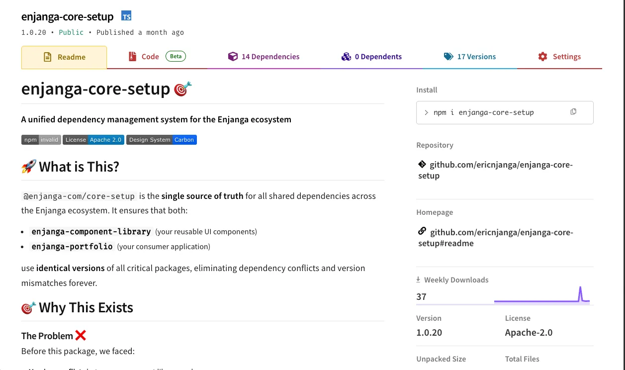
To solve these issues, I created a unified dependency management package to synchronize configurations for my two projects: the portfolio and the component library. This ensured there would be no more dependency conflicts, redundancy issues, or broken configurations, as both projects now source their dependencies from the same package.

Takeaway
This project took me roughly two and a half months to complete. It is a personal achievement that I initiated to challenge myself and hold myself accountable to the highest standards. My goal was to establish a professional environment and create components that adhere to modern standards while remaining flexible, reusable, and scalable.
Next steps
My next step is to lead a large-scale UI engineering project.