The Carbon Design System bakes in WCAG 2.2 AA standards, so most of the heavy lifting is already done. That means instead of chasing every accessibility guideline, I could focus on fixing the smaller, trickier issues in my app.
Accessibility tools making the job easier
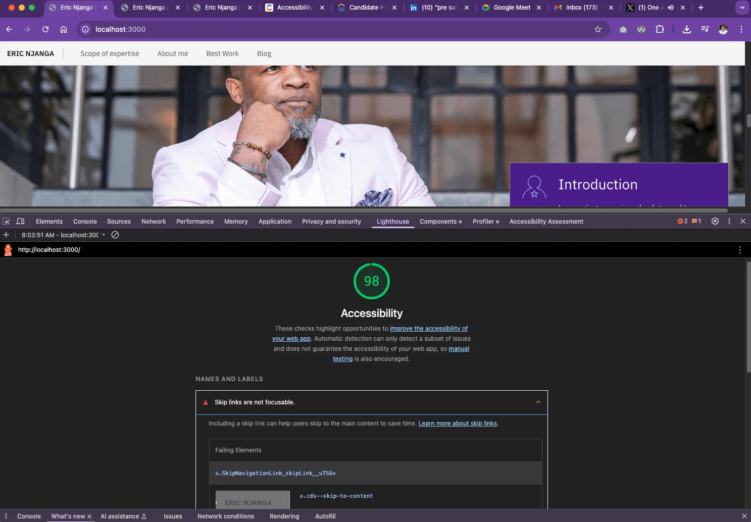
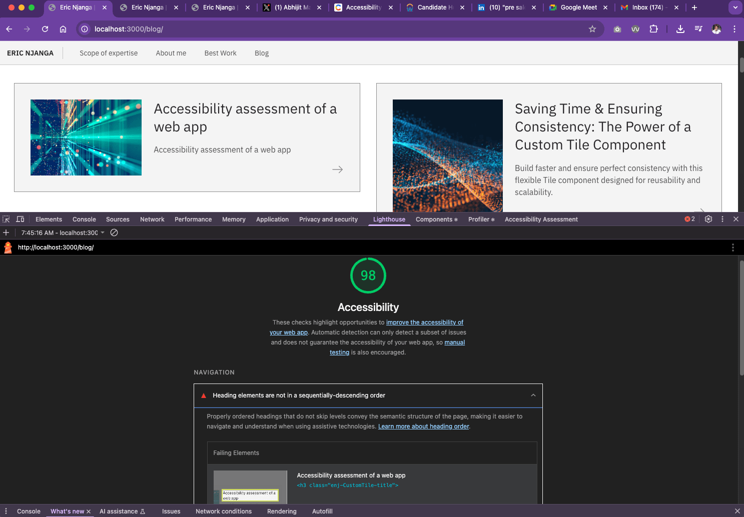
Chrome's Lighthouse on large screens
Lighthouse is my go-to for quick accessibility checks. It runs right in Chrome DevTools and flags issues with clear guidance. For example, it caught a skip link that wasn’t focusable because I hadn’t connected it to the page’s main content.
It also flagged a problem with headings in my blog cards — they weren’t ordered sequentially. That’s a developer slip-up, and exactly the kind of issue Lighthouse makes easy to spot.
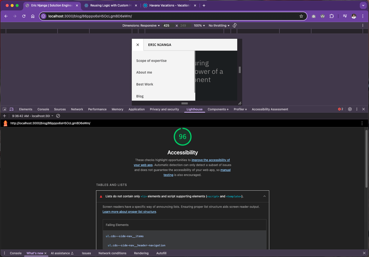
Chrome's Lighthouse on smaller screens
Testing on mobile gave me different insights. Lighthouse showed that my sidebar navigation had nested <ul> elements without proper <li> wrappers. Not something I would’ve noticed right away, but a real accessibility concern.
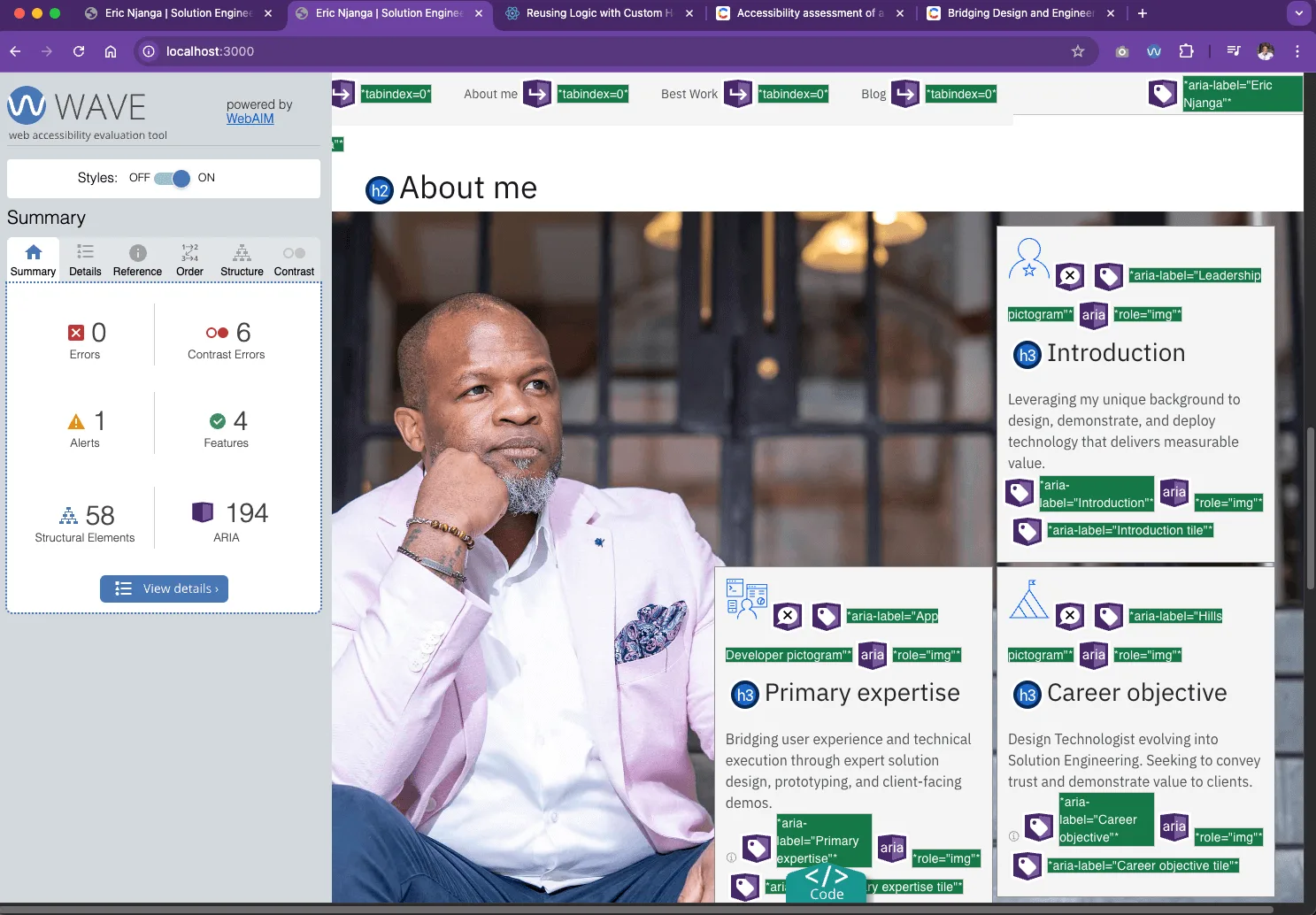
Additional testing with Chrome's WAVE
While Lighthouse is great for big-picture checks, WAVE adds another layer by visually marking accessibility issues right on the page. It makes it super easy to catch ARIA roles, contrast errors, and structural hiccups I might otherwise miss.
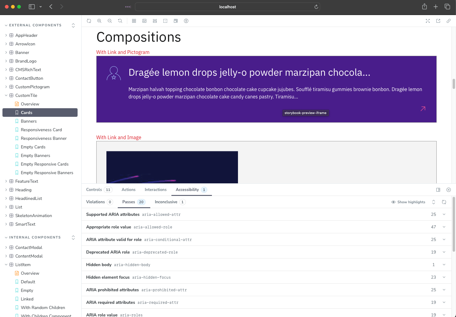
Testing components in isolation with storybook
I also ran tests directly inside Storybook using the a11y addon. This was a game-changer: I could check each component in isolation before plugging it into the app. It saved me from spreading accessibility mistakes across multiple pages.
✨ Takeaway
When assessing your React app’s accessibility:
Start with a strong foundation (Carbon helps a lot).
Run Lighthouse scans on desktop and mobile.
Use WAVE for deeper semantic and ARIA insights.
Test components early in Storybook with the a11y addon.
And remember: tools guide you, but accessibility depends on developer choices.
The goal isn’t just passing tests — it’s building experiences everyone can use.