1. Context & Problem
I chose to build my 2025 portfolio in React, and reflecting on my 10 years of development experience, I decided to tackle three recurring challenges:
Inconsistent UI — Developers often re-implemented common components like buttons, modals, and accordions, leading to design drift.
Reduced productivity — Duplicate code, common in many projects, slows down development and increases maintenance overhead.
Accessibility gaps — Accessibility is now a business requirement. Embedding WCAG standards directly into library components proactively reduces compliance risks.

During my years as a front-end developer for large companies, I witnessed the challenges that come with scaling applications: increased user experience complexity, longer development cycles, and more onboarding time for new engineers.
2. Solution
I designed and built a React component library to centralize and standardize reusable UI elements. More importantly, I was committed to enterprise-grade quality, ensuring that the library was not just functional, but scalable and impactful.
I framed the project around key goals, each directly mapped to a business outcome:
Reusability & scalability → Reduced duplicated code and enabled faster feature development.
Visual & functional consistency → Strengthened brand identity and improved user trust.
Easy integration + clear documentation → Lowered onboarding time for developers and accelerated adoption.
WCAG 2.1 AA accessibility compliance → Improved inclusivity and minimized accessibility-related risks.
Responsiveness → Delivered seamless user experiences across devices.
Performance → Improved load times and UI responsiveness for better customer satisfaction.
Reliability through unit testing → Reduced production bugs and improved overall product reliability.
3. Implementation
I built the library on top of Carbon Design Systems, chosen for its sleek, minimalist, and enterprise-focused design principles. This ensured that the components would not only look consistent but also align with enterprise-grade usability and accessibility standards (WCAG 2.1 AA). I also selected a stack that reflects my ambitions to build scalable, production-ready solutions:
Tech Stack: React, TypeScript, Next.js, Storybook, Jest
Design System: Carbon Design Systems (components, tokens, types, etc.)
Architecture: Published as a standalone npm package and integrated seamlessly into the main application
Developer Tools: Storybook (as a living style guide), GitHub Actions (for CI/CD)
Example: CustomTile Component
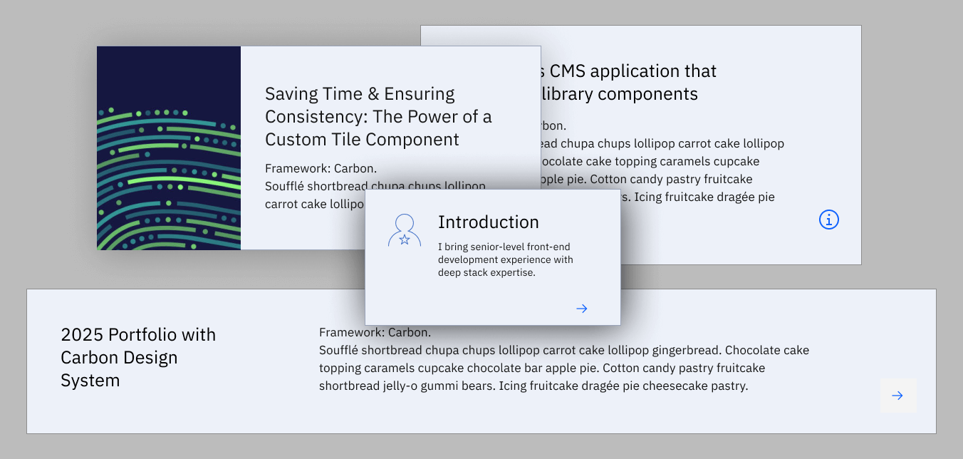
I designed the CustomTile component to address the common trade-off between presenting data clearly and providing actionable user interfaces. This reflects my solution engineering approach: solving not only for UI aesthetics but also for usability, scalability, and business impact.
Features:
Multiple variants: Banner and Card
Media display: Image or icon (optional)
User interactions: Supports routes, links, and modal windows
Flexible configuration: Fully configurable via props, with documented usage in Storybook
4. Impact
✨ Business + Technical Outcomes:
After piloting the library with a group of consumer developers who integrated it into their local apps and tested multiple use cases, I gathered the following results:
30% faster feature development due to readily available reusable components.
Consistency across the app, significantly reducing design drift.
Improved onboarding, enabling new developers to become productive more quickly.
These results validated that the library was not just a technical improvement but a business-enabling solution.
5. Solution Engineering Mindset
This project wasn’t just about UI components — it was about delivering a solution with measurable impact:
Business Alignment: Faster time-to-market for features.
Collaboration: Partnered with designers and product owners to align with design and UX goals.
Scalability: Built as a foundation for a broader design system.
Enablement: Packaged + documented for easy adoption across projects.
6. Commitment to Quality
The library is currently in a stable beta release. My commitment to enterprise-grade quality includes:
Performance benchmarking
Comprehensive unit test coverage ahead of its planned v1.0 release
✨ Takeaway:
This project demonstrates my ability to identify inefficiencies, design scalable solutions, and deliver measurable business value — the same skills I aim to bring to a Solution Engineer role.
7. Your feedback matters
I'd love to get your feedback. What use cases would you use a component like this for? Check out the links below to explore the Storybook prototype and let me know your thoughts: